
How Tesla has taught us that presentation design is everything.
In 2014 Elon Musk presented at a Tesla shareholders meeting, in 2019 he did the same but with one key difference.
That is, the design style of his presentation deck.
The much-needed change transformed a bland, high-school level deck format to a sleek, simple, and effective design that is congruent with Tesla’s brand image.
What can you do to achieve this?
The style that you choose tells the world how to feel about what you're saying. Invest the time to make what you are saying congruent with what you are showing. In 2014, Tesla’s deck was full of bullet point lists using basic fonts and high school level formatting. The design style lacks consistency and for a company that prides itself on its engineering prowess, design and attention to detail, their deck makes the rookie powerpoint mistake of using a stretched out pixelated image to fill the screen.
“Invest the time to make what you are saying congruent with what you are showing.”
Like many other business presenters that are short on time, Tesla has skipped the content planning stage and have created their presentation based on writing a slide header and using a bullet point list to fill up space with little regard to the relationship between the content and the design style of previous slides. This creates a weird, unnatural bullet point sentence structure and disconnected ideas, so that when it comes to delivery, it pulls everything down.

To avoid this when creating your presentations, concentrate on the top ideas and key messages when a lot is going on. Coupled with simple typography and great fonts your deck will be a fantastic aid to any presentation.
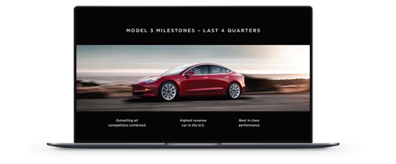
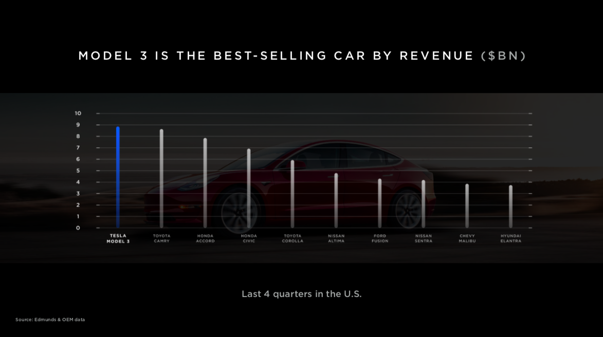
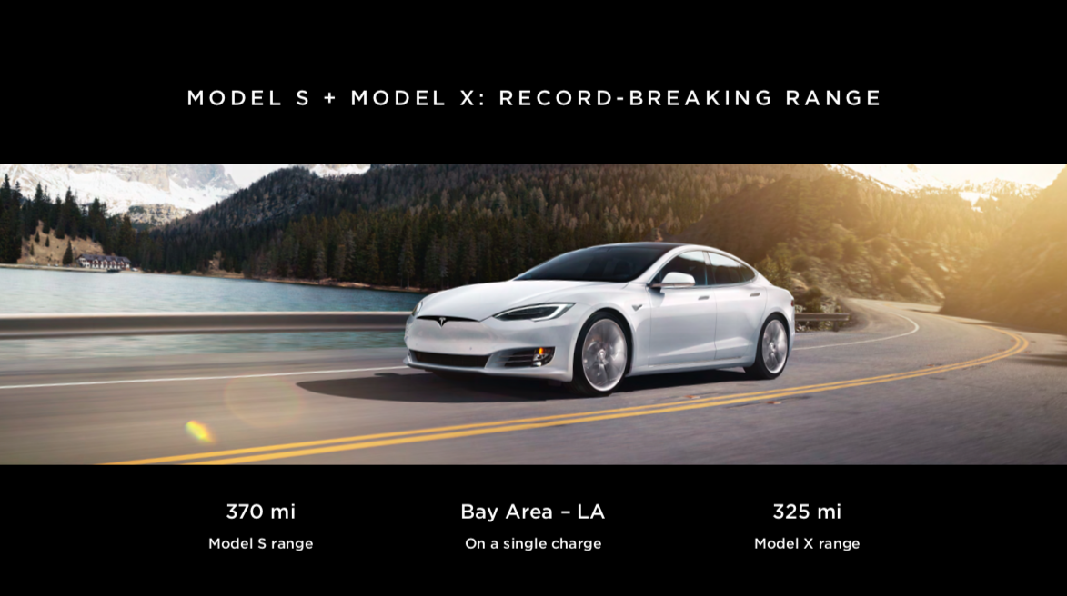
Tesla took this approach in their 2019 shareholders conference. They have evolved their branding from bland red and grey to a new look and have introduced simple typography, and straightforward and effective data visualisation. The 2019 style and theme breathes confidence, achievement, and a sense of purpose. They moved from slides as containers for information to a simple and effective use of three simple key statements on a slide accompanied by a stunning, high-quality action shot of the latest model cars.
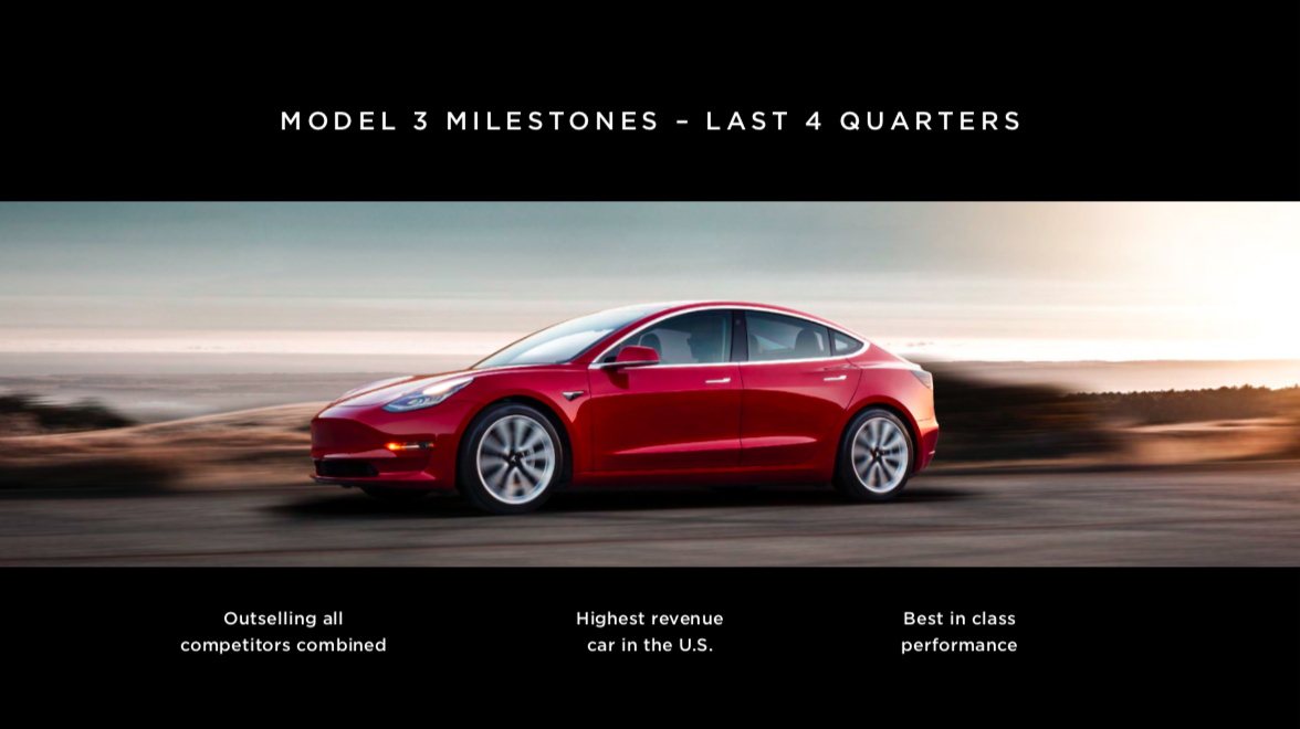
This approach demonstrates two things:
The first is clarity. It comes across very clearly and demonstrates that Tesla knows what they want to say. The simple deck is keeping the presenter on track with short, bold, achievement-orientated statements, rather than wading through the jumbled logic of bullet points. The presentation deck is supports the delivery. With so much happening in the business, they could have filled the screens with content, but they didn't. They did the hard work to focus and give clarity.
Now the hard work here wouldn't have happened in PowerPoint. Firstly a discussion would have taken place to narrow down the presentation’s key messaging - this is shown in the words and statements they’ve chosen to use. But, what Tesla has done is chosen design and typographic treatment that powerfully brings these messages to life and communicates the tone of what they are saying.
When this clarity of content and great design style come together, it creates a beautiful impact.
The team at Presentation Design Co. hopes you can achieve a high impact with your next presentation.
Watch the video below to see the impact a good deck can have on a presentation.
