
$39bn in 4 Slides - How did Square use PowerPoint to land the deal?
One of the most common mistakes we can make when as a presenter is to assume the audience knows exactly what we are talking about. In a professional career, over time, you become a subject matter expert in what you do by being immersed in your world, your challenges and seeing things from your perspective. When it comes to communicating to an external audience, it’s easy to forget that they don’t enjoy the shared experience of being in this world with you and may not immediately ‘get’ what you are trying to communicate.
As a result, ideas get lost, proposals get ignored, deals fall through, not because they weren’t of value or of use but because the audience didn't really ‘get it’ enough to change their minds or get excited about.
Feel familiar?
Great communicators do everything they can to avoid this pitfall by taking the time and effort to give a framework to help you better understand what they are talking about. We love them for it, as when it's done well it’s a beautiful experience and these presenters enjoy a great level of success.
Richard Feynman did this with Physics by simplifying complex concepts to make them teachable, Al Gore used images to show the impact of climate change, Melanie Perkins has grown Canva to be one of Australia’s leading software companies by sharing her story about the frustration of teaching people to use complex design tools.
In a business presentation using PowerPoint, it’s the process of creative visualisation that takes what’s in your head and translates it into something the audience can ‘see’ and comprehend. It makes it come to life by showing things in a common visual language.
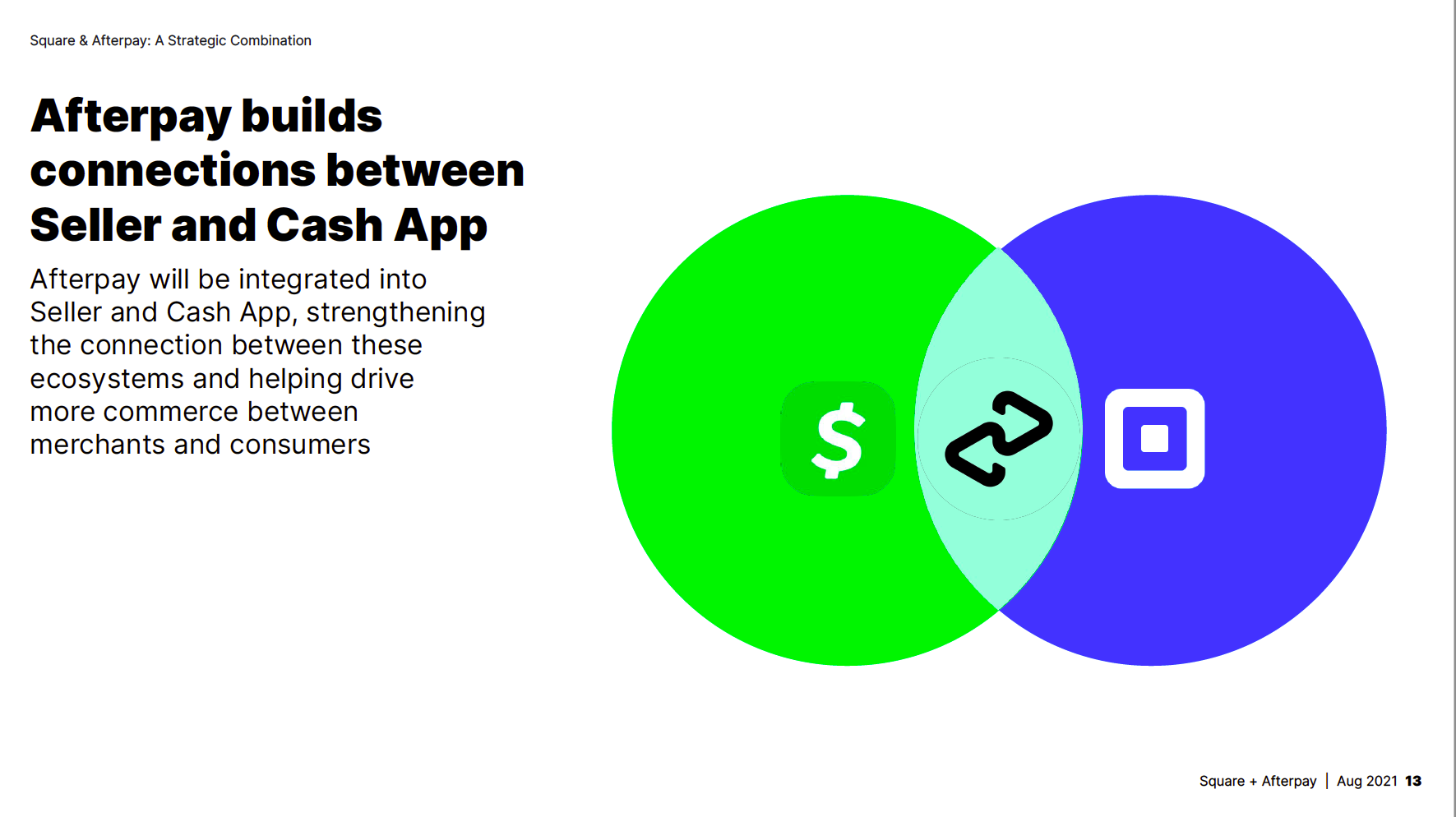
The recent acquisition of Afterpay by US Fintech Square came as a surprise. These are 2 relatively new companies with enormous valuations underpinned by their potential growth in the payments system industry.
So when announcing the takeover, with so much at stake and a whole heap of hard nosed investors to convince, what did Square want their audience to get and how did they use the process of creative visualisation to make sure it was understood?
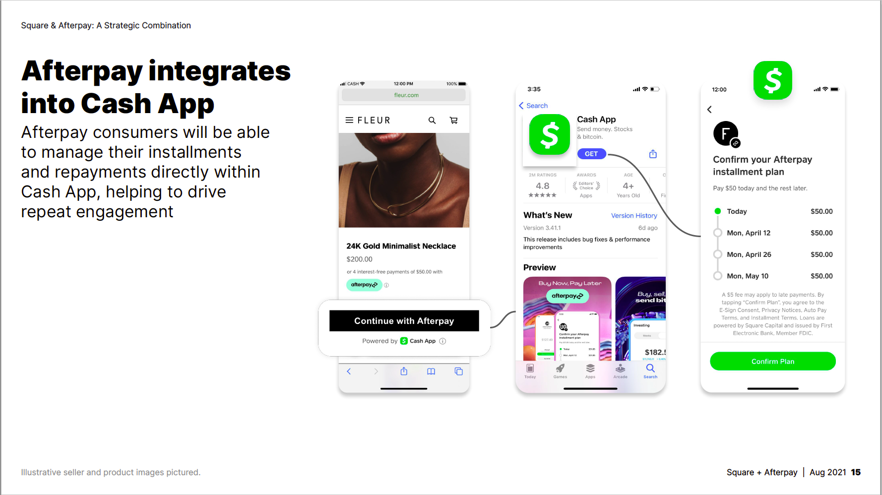
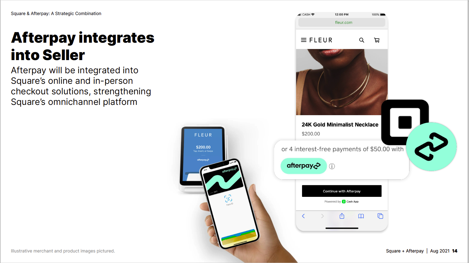
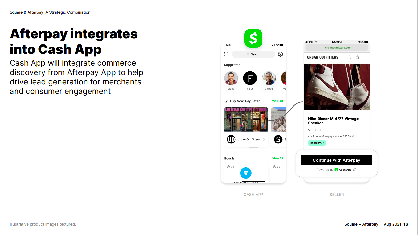
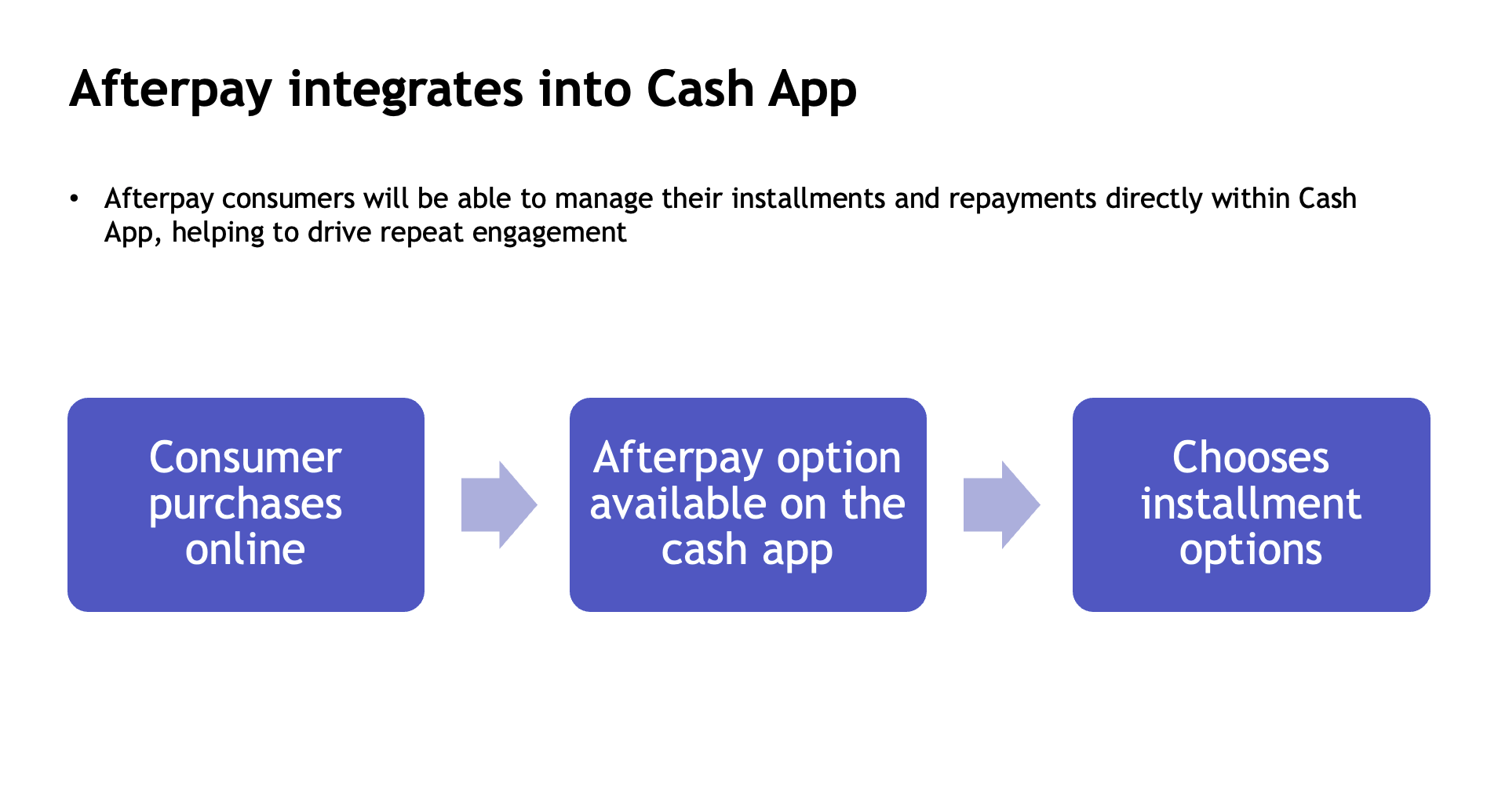
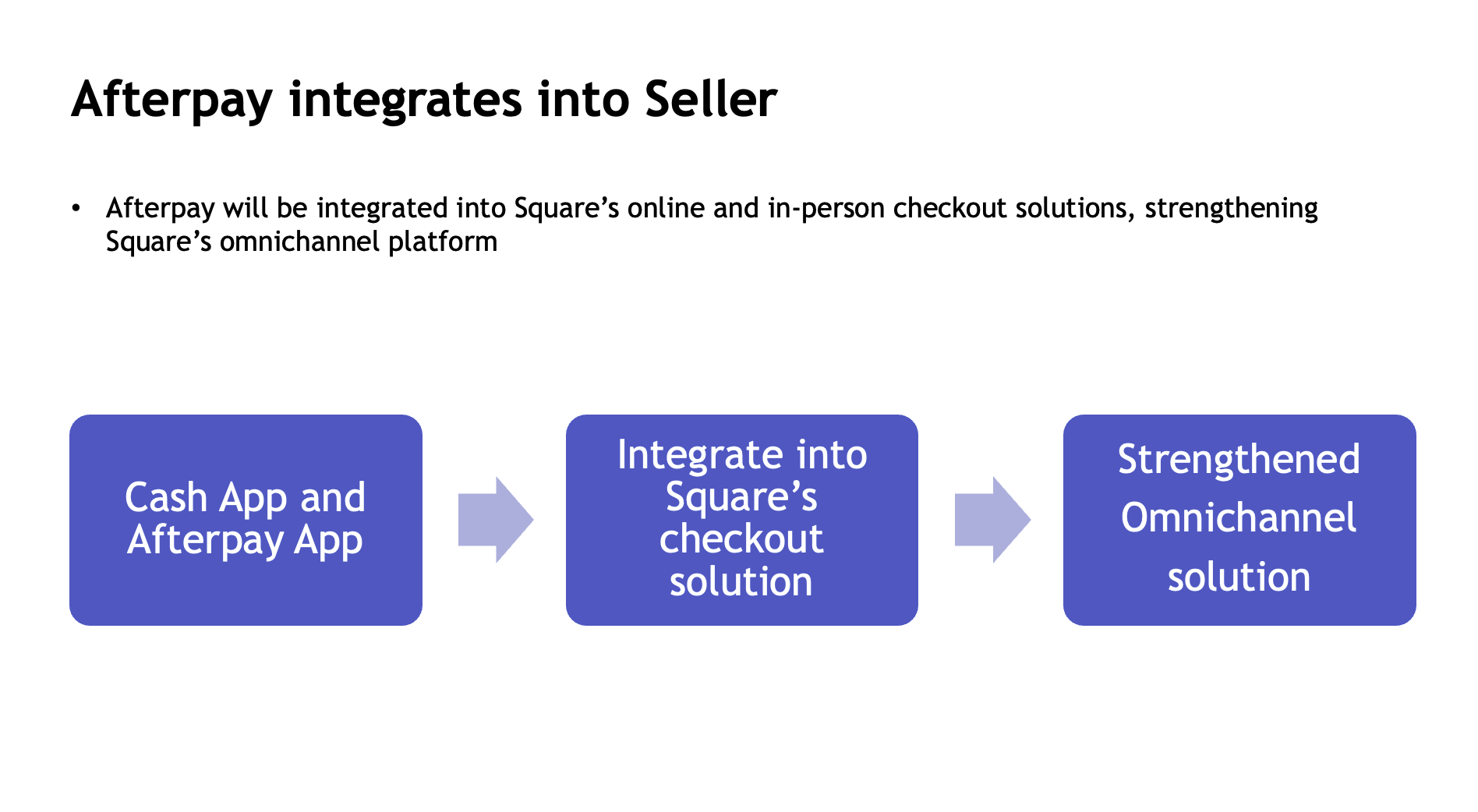
They wanted to share their vision of just how easy it would be for consumers using Afterpay’s BNPL solution inside Square’s cash app. In the presentation, even thought they were under a huge amount of time pressure they did a fantastic job by using a detailed mockup of the app transaction to show what customers would use. It’s simple, sharp and it cuts through to the ‘I get it’ moment.
Here are some of the key slides from the deck;
So what would it look like if they didn’t take the time and effort of creative visualisation?
Let’s try a some different approaches that you tend to see in Business Presentations
First, the bullet point list

Next, the PowerPoint smart art
And finally, the Fivver ‘just put a mockup up’ solution

What difference does it make to the audience?
You might think that in your own presentations that you're able to do this. When it matters, great products, ideas and services need great design. It’s not so much as wanting to be fancy, it’s reducing the risk of not cutting through.
When you are short on time and inspiration, you don’t need to spend hours and hours on the whole deck.
Narrow down the ‘must get’ parts
Think like an outsider about what you need to communicate
Look at creative visualisation as a visual aid
